BY TRACY HOFFMAN
President of the Washington Irving Society
Wednesday, October 2, 2019
The high temperature today in Waco, Texas, should hit around 96 degrees Fahrenheit. That’s what it was yesterday. It’s tough to think about pumpkin spice lattes and carving jack-o-lanterns when we’re ready to bob for apples in an ice bucket. (By the way, does anyone still bob for apples? I can’t say I’ve noticed any apple bobbing lately.)
Though I’m trying to wrap my head around an upcoming October trip to Irving’s “neck of the woods,” I’m having a tough time escaping from a Texas state of mind. After I travel to Sunnyside–after feeing some cool air and after getting some lowlights at the hair salon–I’ll be in the mood to discuss autumn, fall foliage and such, as it relates to Irving.
But heat in Texas is at the forefront of my mind, still.
Yesterday, during a respite form the heat, I spent a few minutes thinking about a tweet from “Peterloo 1819 News.” This Twitter account advertises: “Tweeting like it’s 1819, before, during & after the Peterloo massacre (not just about that, though). In the style of 2019, modern commentary clearly highlighted.”
And here’s the tweet that grabbed my attention and got me to thinking: “Washington Irving was one of the 1st US writers to become popular in Europe & a friend of Scott & Dickens. Rip inspired films, TV, comics, statues, even wallpaper.”
Initially, “film” jumped at me, because the Washington Irving Society is working on a Call for Papers about “Washington Irving and Film.” But then there was that “wallpaper” business at the end, in bold.
I clicked on the photo link and studied the Washington Irving “Rip Van Winkle” wallpaper for a few minutes. That was new information. I wasn’t aware that such wallpaper existed. And I’ve studied wallpaper, believe it or not—for decorating walls and for desktop publishing. I recall spending quality time looking through wallpaper books to find the perfect design to manipulate for a background on some publication.
This morning, with thoughts of the Texas heat and “Rip Van Winkle” wallpaper in my head, I came across Mark Van Doren’s 1930 copy of “Rip Van Winkle.” This library book from Baylor was sitting with a pile of Irving books I recently checked out to study the art work associated with “Rip.” So here are the comments by Van Doren worth repeating:
“It is particularly fitting that the type composition for a new edition of RIP VAN WINKLE should be done in the vicinage of IRVING’s story…It has been designed by Mr. FREDERIC W. GOUDY for the composition of this great American classic by the American author who first interpreted the spirit and function of American literature” (3).
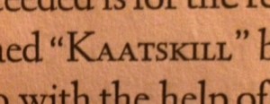
Van Doren continues: “It was Mr. GOUDY’s intention to present a letter as simple, legible, vigorous, clear and effective in detail as possible, and which would show no note of strangeness in the mass. How well he has succeeded is for the reader to decide. It has been named “KAATSKILL” by the designer of the face, who, with the help of Mrs. GOUDY, has engraved the matrices from which it is cast; the setting of the type has been done by Mrs. GOUDY at THE VILLAGE PRESS, Deepdene, Marlborough, N.Y.” (4).
Now, I’m ready to nerd out on typefaces.
Back in the day, while student teaching and paying for another round of undergraduate education, I worked in the composing department of a newspaper. My team worked with the art department to create ads for customers. I spent 40 hours a week, for three years, studying typefaces.
Today, when students turn in papers, I immediately notice the kern (spaces between words), the leading (spaces between lines), and other technical matters that sometimes shock my students. They can’t sneak any oddball spacing past me.
I’ve also taught the “History of Journalism” in a former life, and always loved talking about the history of the press, how type was set, how messy press rooms were, and more.
Despite the fact that I’m too grumpy for saccharine candy corn and hot apple cider, I am terribly excited about learning one more intriguing tidbit this morning about my good friend, Washington Irving, and his legacy.
By the way, F.W. Goudy signed the back of this library book from 1930. It’s copy #1227. That excites me, too, considering all the times I’ve used the Goudy family of typefaces.
Perhaps I’ve used Kaatskill type in the past, but it’s not in my small assortment of fonts in Microsoft Word, InDesign, etc. My goal between now and next Washington Irving Wednesday will be to find and use the font, even if it requires purchasing and calling the IT Department at Baylor.
And that’s all I have for this hot Wednesday in October. I love receiving feedback from readers! Please feel free to add to the conversation wherever you like: Twitter, Facebook, on this page. Also feel free to message me at Tracy_Hoffman@baylor.edu. I try to respond to all correspondence on Wednesdays, and also update the WIS page.
——————–
Works Cited
Irving, Washington. Rip Van Winkle: A Posthumous Writing of Diedrich Knickerbocker with an Introduction by Mark Van Doren. The Limited Editions Club (New York): 1930.

Sorry if this has been posted twice, but Lanston Type Co. has digitized Goudy’s Kaatskill. And it’s on sale at 75% off through 15 May.
https://p22.com/ltc
and
https://p22.com/family-Kaatskill
(careful there are quite a few wonderful fonts covered by this sale!
LikeLike